UI/UX · MOBILE APP
Loud&Proud
A mobile karaoke interface that makes singing with others feel approachable for people who worry about being judged.
Scroll to playCHAPTER 00
Overview
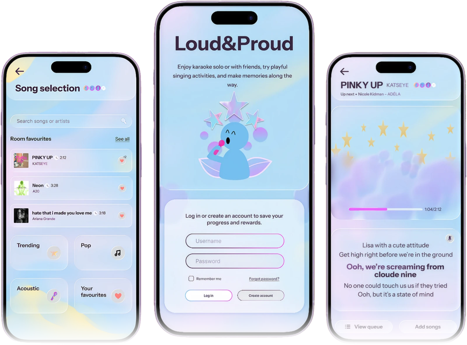
Loud&Proud reduces the social pressure of group karaoke. Solo practice, shared song discovery, an optional icebreaker and playful singing activities give people more choice in how they take part. I took the concept from low-fidelity exploration to a tested, high-fidelity Figma prototype.
- Role
- UX research, UI design, prototyping and usability testing
- Course
- DECO2102 Introduction to Interface Design
- When
- Semester 2, 2026
- Tools
- Figma
CHAPTER 01
Research & persona
Background research and online ethnography into group karaoke surfaced three barriers to joining in.
- 1 Fear of judgement People may want to sing but hold back because they feel embarrassed or worry about how others will judge them.
- 2 Audience influences song choice People weigh whether others will recognise and enjoy their song, which makes choosing harder.
- 3 Uncertainty is strongest before joining in Not knowing who goes first or what to expect delays participation.
CHAPTER 02
Design challenge
How might we help hesitant singers like Michelle feel comfortable choosing songs and joining karaoke with friends, without feeling judged or pressured to perform?
CHAPTER 03
Low-fidelity exploration
The first concept explored session setup, group preferences and a shared icebreaker. Self-critique and external critique pointed to three changes: simplify session entry, avoid defining one "group vibe" that could exclude different tastes, and keep the icebreaker but make it optional.
CHAPTER 04
Visual language
A singing character and pastel shapes give the app a friendly identity. Soft blue and pink backgrounds set a calm tone, yellow adds warmth, and glass-like cards group related actions using the principle of common region. Familiar icons are always paired with labels.
CHAPTER 05
High-fidelity design
Solo mode is a space to practise any time. Rooms let friends sing together, with Room Favourites that show shared tastes without revealing whose they are, song categories as a starting point, and playful activities that shift attention from singing well to making progress together.
CHAPTER 06
Usability testing
Four participants with karaoke experience, three of whom had never used a similar app, completed five think-aloud tasks in the Figma prototype: finding and queueing songs, browsing by category, trying the icebreaker, completing a singing activity and viewing the queue while singing.
| Finding | Design response |
|---|---|
| Activities needed a clearer explanation | Removed the Singing Activities tab from Home, clarified the icebreaker and highlighted its rewards |
| Navigation buttons caused uncertainty | Kept queue and song selection inside the singing session, with explicit "Hide" controls |
| "Add" and "Added" looked too similar | Purple for Add; translucent white reading "Added" once selected |
| Solo song selection was hard to scan | Matched Rooms: categories plus a search bar at the top |
| Pop-ups were repetitive | Added a "Don't show this again" option |
CHAPTER 07
Iterations
CHAPTER 08
Reflection
Testing showed me that a welcoming look isn't enough on its own: clear navigation, helpful explanations and visual cues matter just as much. Removing the Singing Activities tab simplified Home but made instructions less visible, a trade-off between a cleaner interface and clear guidance.
- Singing turns are still unclear: the design doesn't yet show which part each person sings.
- The animated gradient background caused rendering issues on some laptops during testing.
- Next, I'd prioritise clearer singing roles and more reliable performance across devices.
END OF CASE STUDY