WEB DESIGN · HTML/CSS/JS
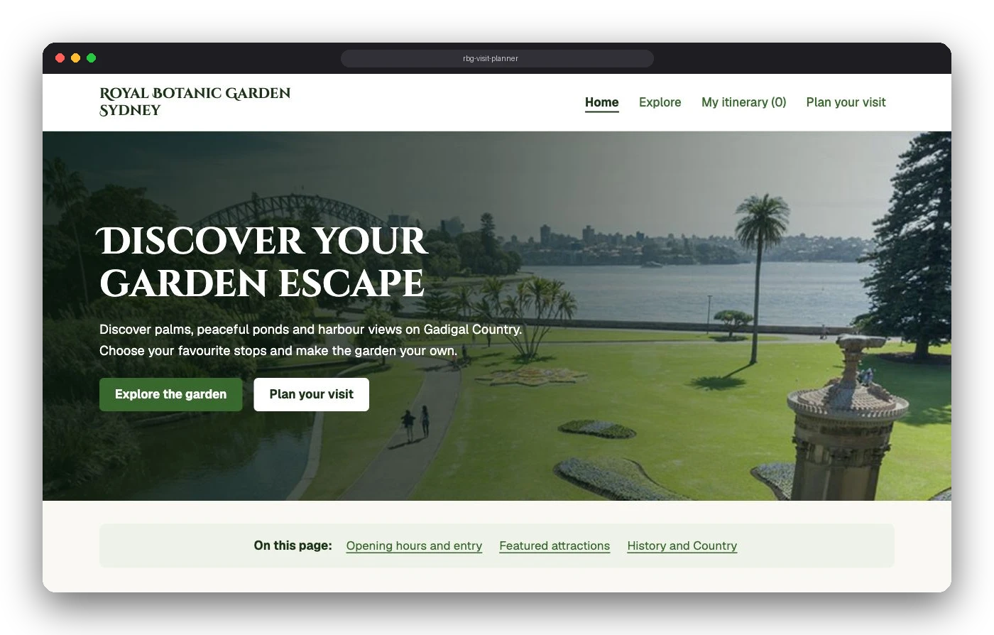
Royal Botanic Garden visit planner
A responsive website that helps tourists plan a garden visit around their interests, time and mobility needs.
Scroll to playCHAPTER 00
Overview
A four-page website, for desktop and mobile, that helps tourists plan a visit to the Royal Botanic Garden Sydney around their interests, available time and mobility needs. Visitors compare garden highlights and build a personal itinerary, so discovery and practical planning live in one place.
- Role
- Solo: research, UX, UI and front-end build
- Course
- DECO1016 Introduction to Web Design
- When
- Semester 2, 2026
- Built with
- HTML · CSS · JavaScript
CHAPTER 01
The problem
How might we help tourists plan a visit to the Royal Botanic Garden Sydney that suits their interests, available time and mobility needs?
CHAPTER 02
Research
I reviewed official garden and Opera House information on entrances, transport and accessibility, then analysed 90 Reddit comment records through affinity mapping. Three insights stood out.
- 1 Time to explore, not just travel Visitors need to allow time for exploring as well as getting between places.
- 2 Access needs specific detail People with mobility needs want specific route details to judge suitability for themselves.
- 3 Interests differ Different highlights appeal to different people, and travel companions influence choices.
Together these pointed to flexible planning rather than one fixed itinerary for everyone.
CHAPTER 03
Personas
- Alex Compares recommendations and wants worthwhile stops that fit their time. → Attraction categories and an adjustable itinerary.
- Sam Uses a wheelchair and checks maps and first-hand experiences. → Route and entrance information to assess suitability.
CHAPTER 04
Structure
The four pages follow the planning process: Home introduces the garden, Explore helps visitors choose highlights, Itinerary brings selections together, and Plan Your Visit covers arrival and access.
CHAPTER 05
Look & feel
Botanical, warm and slightly magical. Greens for foliage, browns and gold for earth and sunlight, Cinzel Decorative for headings and Geist for practical text.
CHAPTER 06
Sketches & wireframes
I compared two desktop Home layouts and a mobile sketch, testing a slider against visible cards. I chose cards because Alex needs to compare options together.
An "Added" state and itinerary count confirm selections without interrupting browsing.
CHAPTER 07
The final website
CHAPTER 08
Reflection
Next, I would:
- Test readability and touch spacing at phone size, rather than assume the narrower layout works.
- Run contrast testing on the final colour palette.
- Replace placeholder access details with verified route and entrance information.
END OF CASE STUDY